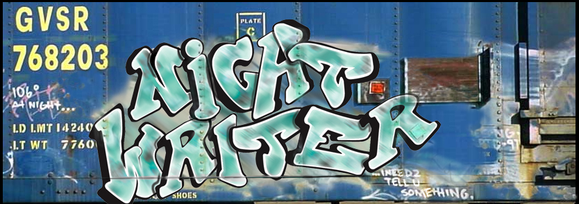
I think the redesign of this blog is finished, unless my behind-the-scenes designer has more tweaks or alternative templates in mind. I love the clean, orderly new look (that reflects nothing of the state of my mind or my desk). Mucho thanks to my friend Tom at The Jestus Company (graphic and web design) for the much needed facelift.
You’ve probably heard that there are three elements to any job: quality, speed and affordability – and you get to pick two. I’m pleased to say Tom is a good bet to go 3-for-3. Check him out.


Lookin’ great, Jon!
I thought I notice something different!
Yes, nice look. Tre bien. Maybe one suggestion, though. Could you make the graphic up top, or at least the NightWriter part, a link back to your main page? Or put a somewhat prominent link to the home page up top or something? Unless there’s something, right now if you get way down in the only link back to the home page is the “Main” link under categories, and that seems a wee bit small and to the side.
Jeff, after your recent comments I feel entirely justified in correcting your French. Tres bien (with a little wing dingy over the first eeee). 😉
The new look is nice. It’s very crisp, neat and easy to read.
I admit Ben, in a French throw down, you’d mop the floor with me.
Jeff, I just had to give you a little slap for kowtowing to Diva.
Jeff, don’t give in to that?? He’s French, he’ll surrender as soon as you put up a fight anyway.
And “French Throw Down” is a contradictory term.
Non Kevin, je suis anglais. Strike that. I meant to say, I am English. And I’ll put on some hobnail boots to stomp you.
Quick Diva quiz: In what Beatle album do “hobnail boots” make an appearance? You may know your Simon and Garfunkle, but do you know your Fab Four?
I love the new look…very professional-like. But it’s really the content that makes this site anyway. 🙂
Ahhhahahaha!
The Beatles’ White Album
“Happiness Is A Warm Gun”
I agree.
Ben, go eat a glass onion, Mr. White (Album)man.
If you don’t mind I’ll consult with Prudence and Martha first.